Color Notations
art .....
Later: Show at NUPOC
Earlier: Code and Data
I have been experimenting with notations for color mixtures, so I can make notes about colors on the go without actually carrying a whole set of oil paints everywhere.
Here's an example from a very quick sketch during tonight's commute home:
Though it may look black and white, there are a dozen colors captured in this quick sketch. In this post, I briefly describe the notation.
The letters are based on my oil painting palette of late: usually,
| name | provider | pigment number | code |
| cremnitz white | RGH | PW 1 | w |
| nickel (titanium) yellow | Williamsburg | PY 53 | n |
| winsor (primary) yellow | Holbein | PY 74 | y |
| raw sienna | Gamblin | PBr 7 | s |
| transparent earth yellow | Gamblin | PY 42 | t |
| venetian red | Gamblin | PR 101 | v |
| cadmium red light | Gamblin | PR 108 | c |
| pyrrole red | Holbein | PR 254 | p |
| brown pink | Williamsburg | PR 101 | - |
| spanish earth | Williamsburg | PR 102 | a |
| quinacradone violet | Gamblin | PV 19 | - |
| dioxazine purple | Gamblin | PV 23 | - |
| cobalt blue | Gamblin | PB 28 | o |
| (real) manganese blue | Vasari | PB 33 | m |
| prussian blue | Gamblin | PB 27 | r |
| ivory black | Williamsburg | PBk 9 | b |
| viridian | Gamblin | PG 18 | i |
| terre verte | Gamblin | PY 43, PG 18, PBk 9 | e |
| raw umber | Williamsburg | PBr 7 | u |
Since there are fewer than two dozen colors, a single letter can be assigned to each pigment (the rightmost column shows my assignations as of this morning). I'd like to whittle the number of colors down even further, but I'm hooked on the various properties of each of these. Almost all of them are pure pigments… the only mixture is terre verte, which I love for its transparency, mass tone and utility in mixing cool midtones.
Occasionally I'll throw in another pigment for special occasions, or start out with just a few for underpaintings, but usually I lay most of these out for any given painting session.
The notation, then, is very similar to that used for writing chemical compositions, which you might remember from high school chemistry: $\mathrm{H_2O}$ is water, and $\mathrm{C_{18}H_{32}O_2}$ is linoleic acid, one of the components of linseed oil.
For paint mixtures, we apply a similar rule: one letter per "element" (paint color/pigment), with an optional numerical suffix to indicate a correspondingly higher proportion (for simplicity we eliminate the subscripting of the numbers).
For example, king's blue, which is typically white plus cobalt blue, is, in my system,
w2o
… i.e., roughly two parts Cremnitz (lead) white per part of cobalt blue.
Not every color I might use is assigned a letter. In this case, just write the pigment code in parentheses. For example, for an exact match for commercial king's blue, I would use titanium white (PW-6) instead of the more transparent lead white; in this case, king's blue is
(PW6)2o
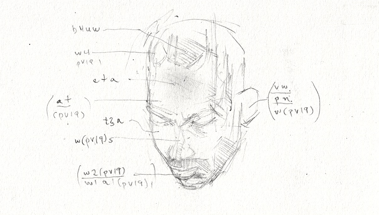
Now let's talk through the sketch at the top, location by location. The head is mostly backlit (contre-jour) with light from the window and some interior light inside the train.
- Hair on top of head, b4uw: four parts black, plus raw umber and white.
- Fairly flat area of color on forehead, eta: terre verte plus transparent earth yellow plus Spanish earth.
- Left upper highlight, w4(PV19) - mostly white with a bit of quinacradone violet.
- Forward/top plane of nose, w(PV19)s: white, quinacradone violet, raw sienna.
For the ear, we use a variant of the notation which has light, mid tone, and dark values, stacked (in parentheses):
| vw |
| pn |
| w(PV19) |
… which means,
- Light: venetian red + white
- Mid tone: pyrrole red + nickel titanium yellow
- Dark: quinacradone violet + white
For the lips I could see, roughly, light and dark values:
| w2(PV19) |
| w1a1(PV19)1 [the 1's are superfluous] |
i.e., two portions white per quinacradone violet for light, and white, Spanish earth and quinacradone violet for the dark.
Are you serious about all this?
This may seem like a lot of work, or hard to remember. The notation is highly personal, though – your palette and your notation will be different, and you will remember yours better than mine. I do find it interesting that in just a few minutes I was able to make a study recording a dozen color decisions with just paper and pencil. One could work up a simple portrait on this basis alone (especially if the sketch were a little more complete).
This will be hard to do unless you've painted enough with your palette to have some knowledge about how your colors behave when mixed with each other. It is a good way to practice thinking about color when out in the world and away from the easel. Like preparing for drawing from memory, it's something you can do just about anywhere.
This is a work in progress: since I used quinacradone violet multiple times in my sketch, I am hereby officially dedicating the letter q to that pigment. Maybe Williamsburg brown pink can be k (originally reserved for my chalk putty medium, which maybe I don't need a letter for). Dioxazine purple can be d. As my palette evolves (as they tend to), I expect to swap around my letter assignations … and will have to remember to write down a key now and then so I can still "decode" my notations in years to come.
Later: Show at NUPOC
Earlier: Code and Data